







We may not realize it, but we encounter design with nearly everything we interact with. Our favorite coffee mug, our mattress, the packages that hold our food have all gone through a rigorous design process–but what about the apps we use? The websites we interact with to navigate banking? Healthcare? Voting? This article you’re reading right now? All of these have gone through a design process as well that is known as UX/UI or User Experience/User Interface. When it comes to a navigable product like a website or an app, the layers of design go deeper than appearance to cover the realm of accessibility and inclusion.
ABILITY Magazine’s Gina Velasquez and Jennifer Woodall joined UX/UI designer Joshua Towery to speak about navigating the design world with colorblindness, how UX design makes tech accessible, and the drive for an inclusive design industry.
Products & Services


Jennifer Woodall: Can you tell us a little bit about yourself and what led you to become an artist and UX designer?
Joshua Towery: Sure. So the art has been since I was a child thing. I’ve always drawn, and so this is something I’ve always done. I guess, professionally, it led into UX design because I started off as just a designer when the Internet started. I started in print, so to bring it back, this was back when you had to draw something, scan it, turn into a vector image, and then you had a logo. If you could draw, then that was all the better for you as a freelancer. I did logo work for a long time. Then that just evolved as the whole nature of things evolved, and it turned into internet sites and doing design for that, and then learning how to program from the people I worked around. I saw that developing wasn’t too hard to do. I took the whole gamut of doing that plus designing. Over the years, it was 3D animation, it was video work, it was everything that was creative to turn something into something better for these people, and so UX design is just something that I’ve always done, really. It’s just it turned into an actual title a few years back. It’s always been about the experience, right? So that’s the good part, is it turned into a very high paying particular thing. It’s an encompassed procedure to do the whole thing, but that’s what I’ve always done.
Woodall: What is your artistic process like from idea to final product?
Towery: The process? Interesting. You mean for professional stuff or just…?
Woodall: Both. I’d like to hear about your professional work and the paintings you do.

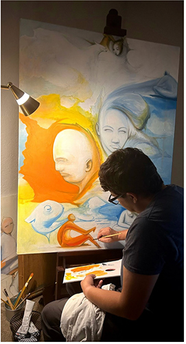
Towery: Sure. Well, starting with the artwork, there really is no process except just staring at the canvas and something will happen, so that’s the idea. I don’t really do paintings of something. I don’t really do portraits and try to nail down something like that. There’s a lot of realism in what I’m going to do, but I don’t really do reference stuff. I like to do a lot of very, very realistic things, but you have to be able to see it and then put it on a canvas or draw it. That’s easy for me to do, so that’s where it starts. Then just experimenting with a lot of different lighting, a lot of different color interaction, and then something cool will happen. People can interpret it after the fact all they want as to what it means. I’ve learned that it really doesn’t matter if I try to make something that means something because it won’t mean anything the same way when it’s really even done.
There’s a lot of shared-line stuff and a lot of experimental stuff happening that maybe people don’t even realize, but it’s a challenge to just do these little experiments, and that’s basically what it is. It’s easy to do something that’s a reference piece. If I want to do a painting of a painting, that’s not hard to do, or just do a portrait of somebody’s face, that’s not really that hard to do. Anybody can pretty much do that. It’s not really that fun for me to do necessarily that, but it’s realistic as it needs to be along the way. Same thing with professional stuff. People need something that on a UX level that makes you feel something and needs to feel a lot different than the competitor stuff.
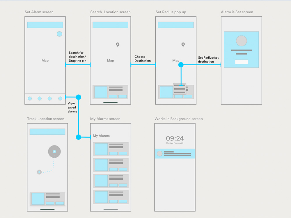
If you can get something in Figma–I do a lot of Figma stuff, which is wonderful, that’s the tool that we all use–but doing a prototype in Figma, knowing that you can execute it out as a developer, knowing how to execute in a CSS way and all of these things, you’re not trying to perform something or put something in front of everybody that really can’t be done. I put something that’s a lot different because there is the same experimental stuff happening. It’s experimenting with stuff with color, with layering, with font-sizing, with padding and spacing, and all these normal properties of something, but you just got to do it a little different. If you don’t do it the standard way, then people respond a lot better. If it’s upper management or if it’s other developers, they’re like, “Oh, it looks amazing. It feels like this.” that’s the whole idea. As long as you make them feel something but execute it, that’s the real thing. You’re not working in Illustrator anymore for just prints. You’re not doing stuff in Photoshop anymore to be able to hand it out to somebody, and it’s their problem to make it into a website. Now you can actually combine the two and you know you can actually make it happen. If you know Material Kit, if you know how to use Bootstrap, and you are familiar with these things, then you can anything. So that’s what we’re doing these days.
Woodall: For our readers that might not be familiar with the design world, can you explain what is Figma?
Towery: Sure. Figma is that branch between people that don’t code, and they’re not designers, they’re not developers, but they need to see a prototype of something that’s clickable. That’s all they want to do is when I click this, it does this. When I want to hit a drop-down, it shows me a drop-down. When I want to hit a link, it goes to a new screen. Those are all Figma screens within Figma. But if you know how to prototype, then you can make them go and interact with each other, as if it’s already coded, and then you hand it off to a development team, and then you make it into an actual application. That’s the nature of Figma. It’s a wonderful tool. Maybe Figma will read this and I’ll get something.
Products & Services


Woodall: (Laughs) Yeah! So as a visual artist, outside of your design work, do you have a favorite subject matter or theme that you tend to gravitate towards that you like to paint?
Towery: I guess the theme would be experimenting with lines of other things. So, there’s a lot of shared-line things happening. I didn’t know about Dali growing up that much, but it seems to be a lot of that stuff because it doesn’t really make sense, but it’s just experimenting on a piece of paper. That’s basically the only style that I have–just surrealism, I guess, if it has to be categorized, and that’s with the color as well. Sometimes I’ll go and I’ll paint, and it has nothing to do with referencing what color it really is. It is a feeling. It’s just an experiment on itself.

Woodall: How do you decide which color palette that you want to work with?
Towery: Good question. Well, these days, I’m doing stuff for independent or individual states, so I’m working on some application work for Texas, Iowa, and West Virginia. Let’s just say a couple of the list ones. Those are some color palettes in themselves because of the state seals, so that’s a particular way we make a materials kit based on themes. It’s not like we have to do everything in CSS, where every different div or every different item on the screen has to have a CSS property. It’s inherent with a light and a dark theme, so there’s ways to group these things. Through the application, it will have a particular look and feel. That’s how we decided for the most part. We have a light version and a dark version. That’s a standard thing you have to do. You have your mobile, your desktop, you have all the imaging stuff, but the color palette, it usually stems from if they have some brand guidelines–if the company or the individual thing you’re going to develop should have some style guide.
If it doesn’t have a style guide, then maybe one should be made, and that’s where you go from there. So, there’s a color palette that’s either based on the product itself or we just go ahead and make some stuff in Figma and we give it a new look and feel. There’s a lot of blues. Different shades of blues seem to be the winner–orange and blue, I like using those intertwined so it makes a good feel with some green thrown in. People still love drop shadows–drop shadows will never die. I don’t like to use a drop shadow on everything, but let’s say just material kit cards, by nature, they have a drop shadow. That’s just a very not elevated one, and everything has to have a really light stroke around it in rounded corners. So that’s a standard thing. It’s going to be 100 years before that particular style goes away, but that’s the way it goes for some people, for some clients, and for some websites. That’s the way you have to do it. There’s colors and there’s styles, but those are basically the things that I would start with.
Woodall: Can you talk about your experience navigating the creative industry with colorblindness?
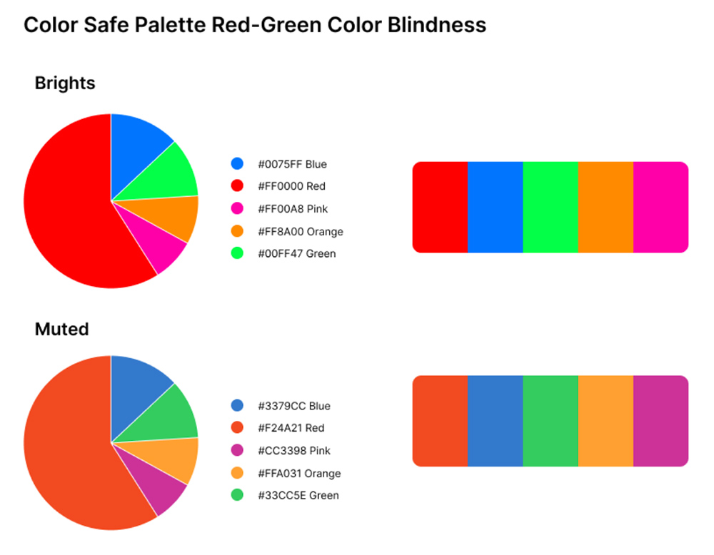
Towery: Sure. Well, in print, it was a different time. I didn’t have Hex color charts to reference at all, really, because there were none. At that point, it really wasn’t developed. As somebody who’s colorblind, it was very risky for me to do anything in a print setting because my prints did not turn out like I thought they would, and there were some clients that were like, “Why do you keep printing it green?” or “Why do you keep printing it purple?” I’m like, “Oh, man, it’s the printer.” So small contract stuff, but I screwed up some stuff that really made people think, “You don’t know this.” I was like, “You’re going to fire me or you’re not going to pay me if I tell you I’m colorblind now.” But I was going to do it, it’s just that I needed some reference. I made my own references along the way. I have my own color charts, and that was a risky thing. The people that I work with now, they really like the fact that I am, so that we can make sure they’re covering that angle, too. So, a lot of ADA compliance that I’m doing, that’s one of them that they’re now starting to take serious in a certain way. It’s fun now. It’s not a bad thing anymore. So that’s good. But for a little while, it was a little stressful.
Woodall: What advice do you have for other artists with colorblindness that are wanting to enter the design sector, but may be hesitant about it?
Towery: Just to be upfront about it, but also know how to work within the referenced realm of Hex colors. You need to reference things anyways. You shouldn’t be going off the cusp about new colors all the time. I can make this shade, and that’s it. You have to standardize yourself. There are libraries that need to be used because the developers are going to use these libraries, too. So that’s your first step–understand that you’re in a company, that you’re no longer doing freelance stuff and that you have to be able to use your resources. You’ve got to use your resources. There’s a material library for everything. There are internal libraries in companies. Find out what they already use. If they don’t have anything, then build it for them. Then have your own palette that you’re going to reference. It’ll make you all the more useful at the company. It’ll embed you even further. Typically, they don’t have anything like that, and they don’t even know why they don’t, because it wasn’t that big of a deal. Well, it’s not that big of a deal, but if you’re a colorblind person, don’t worry about that part, just use your resources that are out there and just reference those things just like you’re supposed to do.
Products & Services
Velasquez: I’m very interested to know how colorblindness impacts your everyday life.
Towery: Well, the first thing that comes to mind are traffic lights. At a distance, I don’t know what it’s on. That’s the pain in the ass part. I don’t know if it’s red, yellow. The green, if it’s not a really bright green at the bottom, then I don’t know it’s green, and I have to be able to see the whole object before I can know if it’s at the bottom or the top of the brightness. Then getting up closer, I couldn’t tell if it’s red or I guess it’s orange in the middle, but whichever one is on that way.
Velasquez: It’s yellow in the middle.
Towery: Okay. Well, there, so it’s yellow in the middle. It’s orange to me, and the bottom one is just a really lite green, apparently a white. See, it’s white to me. So if it’s a brand new one of those, it’s like a white, an orange, and a really bright fire truck red. It’s location more than anything. Different signs that are like that, definitely. I have to use a little bit more common sense on stuff than relying on what color it is–I have to read the thing or I have to judge it in a different way.
Velasquez: That’s true. And drive slower.
Towery: And I drive slower, right. You have to be careful. Oh, yeah. I’m a slow driver when it comes to that for sure.
Velasquez: Did you notice a lot of differences when you were growing up, too? Was it also difficult when you were younger?
Towery: No. When I was growing up, my mother discovered it when I was 11 or 12 or something when she finally asked me why I colored all these people green on my paintings and drawings. I was like, “I really don’t,” and she did a test where it’s the ink blot thing, and then we found that I was colorblind. It was a later in life thing more than anything, but I didn’t give it too much attention. I didn’t think much about it growing up until it turned into a professional situation. That’s when I was like “This really sucks.” and that this was something I had to actually work around. That was only in the print days. Now in the web stuff, it’s a big relief because we’re no longer looking at two different situations–what it seems like on my monitor, it’s going to look like that on their monitor, too, and I can verify these things with a simple piece of code. So that was a big, big change.
Products & Services


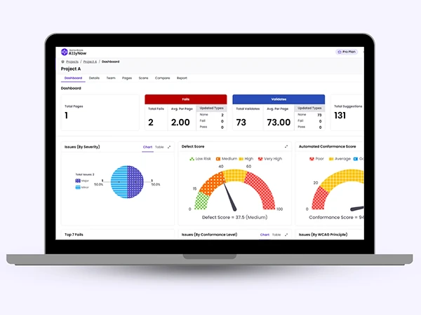
Velasquez: You said you produce web content that’s ADA compliant. I’m completely blind, so my user experience is very different. I don’t rely on color. I rely on sounds. I do remember when I had some vision and mostly what I recall in terms of user experience and where I was looking for a better way to experience web pages. As part of your ADA compliance, do you ever look at those things for people who have to enlarge things, and if the page is very busy, if there are a lot of colors, things that are distracting you from the information you’re trying to get to, is there something that is part of the rules of ADA compliance in terms of web design?
Towery: Yes. It’s now to a degree where things are not overlapping. We don’t have anything that’s–how do I say–moving in the background or anything like that to divert attention. I do make my templates up to 200%. We do the bootstrapping thing, so as long as it’s up to 200%–
Velasquez: Excuse me, what is bootstrapping?
Towery: Bootstrap is a CSS file and a JavaScript file together that’s calling three different classes of the same object so that on a mobile version of something, it looks like it’s supposed to on the mobile version. Then the desktop is spread out and it scales itself. It’s a scaling of things, but you have a JavaScript file that handles the switching for you. You make one file on the coding side, and then you change CSS classes along the way. That’s where some of those issues come from if they’re not bootstrapped and ready for this situation. When I got hired, that was one of the first things that I brought in to play was that we needed to take advantage of the bootstrap situation, but it’s also very much because of the ADA compliancy. All of the things that I do for the company is based on that, and it’s also based on not trying to get too cute on the overlapping of things and all of these animations that don’t need to be there. It’s also making sure that everything’s tab indexed correctly. Everything is absolutely readable as it should be. We have objects that are not scrolling when other objects inside of that object need to scroll. If you have a bunch of tabs that are inside of a particular container, we need to just scroll that particular tabs container, not the entire screen, so a lot of that stuff was just not done because it wasn’t called upon to do it. When I got hired, that was definitely my main thing–to bring that to attention and then be completely okay with our screen readers. So that was another effort in itself. But yes, that’s my job is to do those things, and I’m definitely doing them.
Velasquez: Yeah. It’s difficult to navigate some pages if there’s just too much going on and it’s hard to figure out the flow of information and get to where you want to go.
Towery: Yeah. That’s what we’ve done with the applications that I have. It’s for voting situations, and it’s on the state level. I don’t want to name the company, but it’s on a state level where we’re doing voting situations. Also, I got to log in as a county user. I want to see voter stuff. I want to see stuff in my county for how much the election has spent this year. I want to do all these things. It’s a lot of graphs, but it’s a ton of data, and it’s a ton of navigable data, and there’s probably 150 screens that you could end up going through on this particular application. It needs to be there for a public use as well. That’s why it needs to get ADA compliant in a hurry and why the developers are now going to understand that when they release something that they call done, they’re going to have to check for this stuff. They can’t just put something out that’s going to be uncompliant just because they say it’s done on development side. This is a new thing. Developers on this particular team are very high level, but because of me, they’re having to introduce one last check on their stuff before they put it into a build, and that’s being compliant. There are tools to run inside a visual studio that will make sure that if they’re putting something out there that is not going to meet our requirements, it’ll tell them even how to fix it. There’s really no excuse these days for people to make stuff that’s not compliant. That’s just the bottom line.
Velasquez: Do you have visually impaired people on hand to test your products?
Towery: Not on hand. I brought it up many, many times. I’m like, “I can do these tests all I want, but I’m not going to give you the full report without some actual use cases.” So, yeah, that’s what I brought up. It’s not for the election itself. It’s actually to handle state-level money and candidate information and all these different things, so it’s not that we’re doing the presidential stuff. It’s more like on a local level because it’s extremely data-driven. When we’re going to go live for these particular states, it’s been brought up that either the state gives us a third party or we have internal people, but somebody needs to give it that full check before we release it for sure. And everybody’s aware of that. I can tell you that.
Velasquez: Right. Thank you for your work.
Towery: No, it’s what I advocate for, and it has nothing to do with the colorblindness. It has everything to do with me having seizures. It has everything to do with the fact that I understand what it can be like, but there’s a whole another arena for folks that want to use this. There’s different ways to put it to the managers and be like, “We need to captivate all of our audience.” But my own seizures put me in that particular club. Up until a couple of months ago, I was having seizures maybe every week, and the company was working with it, but I was waking up and I had no idea who I was. I didn’t even know I had a job. I have my wife, and we’ve changed things. I’m in the club of different things to advocate for, and they know that.
Woodall: So you have developed these color guides for accessibility for colorblindness. Can you go in a little bit about that and what that is and how you utilize it?
Towery: Sure. It’s there for our own referencing to use on different teams. When I made that, it was right when I got started doing the civic or the company style guide for themselves. So making their color palette, and there’s a colorblind version to where they can see what it’s going to look like and if we need to adjust the template and stuff, they had it for reference. How do I say? It’s being used when it needs to be used. It’s there as a reference more than something that we’re using. It’s there for print, mainly, so if we’re going to be printing off user manuals or anything that’s instructing these poll workers to do things and all that stuff, which is a lot of print stuff, then that’s where we have them come into play, mainly.
Products & Services

Woodall: Okay. And to go a little bit into the screen reader side of things, I’m curious about how you determine the language that’s read when certain buttons are highlighted by the screen reader. Who comes up with the descriptions of these things?

Towery: Got you. If it’s an image, that’s where the description comes in. That’s from the product team. When a screen is developed and then put out into the application, it goes through a build process. That build process puts a lot of extra code on these screens. I don’t know why, but the developers told me that’s just part of the process. Sometimes if there’s an ID there, but nothing’s in the property value, then there’s just a blank ID value. It will fill in certain things for us. We’ve had to work around that the verbiage that is put there comes from the product team, and they’re written inside of the user stories, which comes from meetings with Texas and Iowa and these people. They’re the ones who are putting labels on buttons if it needs to be something different. But the development process, it puts its own ID with whatever the property value is, and that’s what it reads out.
By default, it’s going to just read what’s already there. Using a default screen reader like just JAWS or anything else that we’ve been using for testing, It’s worked so far. When it comes to the image descriptions and stuff, that comes from the product team, and there’s a QA – a person on that team, and they’re the ones that give us some pretty good verbiage for the stuff. It’s placeholder until that happens, but that seems to be the only part that doesn’t get taken care of in the build process, but everything else is okay, and everything else is tabbing like it’s supposed to, and it stops reading when it’s supposed to. It’s not something I manually have to do, and I think it’s because we’re not in an HTML setting. We’re inside of C# with Visual Studio and a lot of different stuff that’s building these screens. There are so many microservices that are pulled in, there’s all these different screens that are being built by these other microservices and stuff, so it’s not a static page by any means. I think when you’re doing an application versus a website, there’s different outcomes. This seems to be one of the good ones is that it reads itself quite well.
Woodall: Okay. Thank you for the insight on that. I was always curious about how that gets decided and worked into the page.
Towery: I mean, it’s decided upon by me that it’s okay to do, and that was the first thing that I did is I just started letting Microsoft’s narrator read stuff, and it did pretty okay. Then when we got into the nitty of what it’s doing, then we can do that with CSS as well. There’s a lot of different ways to get a description on stuff, but the idea was, is it even tabbing correctly? Because there’s ways to get the whole navigation and get it right to the first line.
There’s a lot of different ways to navigate through the screen, but it was starting everybody from the top left, no matter what you were doing, so it had to read everything. Then finally, you got to the stuff, it was like, “but, but, but,” and it would just read everything until you knew what to do because there was no other way to do it. The arrow keys didn’t do anything. There were no shortcut keys. There was nothing. We’re talking about a team of 25 developers that really don’t care about this stuff, but they need to. When the functionality works, they move on to a different user story. Right now, since I’ve been there for over a year, they understand that’s not the end of the road and that they need to put something out that’s not going to screw up the whole accessibility thing, and they need to keep us accessible. It means a lot. Now they understand. It makes them feel much better to know that they’re making something that isn’t going to have to be recoded, too. We told them they don’t want to have to go backwards. They need to make sure it’s there.
Velasquez: I can relate to everything you just said.
Towery: Well, I’m doing it for you and for all these folks that have to do this shit. The least we could do is make it a better experience. I mean, it’s the whole UX part of what I’m doing, and this is a voting situation. This is a government site situation. It should be really good anyways, because they’re supposed to have that standard of stuff. We’re making sure.
Products & Services

Velasquez: Were you one of the first people screaming in the desert for something like this?
Towery: Yes, for sure. I think as part of my interview, I brought that up. As a designer, you can do things however many ways you want it to and impress this and put drop shadows on this, and I told them, “I’m an ADA-driven designer, meaning that’s going to drive our choices, and we can make things still wonderful. It can be an amazing experience and wonderful design, but let’s make sure that it’s that compliant, and that drives our choices here.” So, they needed somebody on board that was an ADA person. Once I told them that, then I think that’s what got me the job. It’s because I screamed it at the interview, and now I’m the advocate for everybody, and that’s just part of it. I’m on every team, and that’s part of what I’m on the team for, is when they start bringing that stuff up, I’m telling a lot of people, “This is the way we do it now.”